Mobile App Concept for IHG
A digital concierge chatbot that optimizes every touchpoint in a traveler’s journey
My Role
👉 UX/UI Designer
Key Contributions
Defined and delivered user personas, user scenarios, wireframes, and UI designs
Here’s some context to start
A multinational hospitality client tasked my team to explore leveraging chatbots, user data, and third-party services to build a personalized platform on top of their existing app that would go beyond the standard touchpoints of hotel hospitality (booking a room, checking in, checking out, etc)
Client workshops to define the business requirements and customer needs
We worked closely with our clients to plan and conduct multiple workshops to define key features the concept would demonstrate. Discussions included what third-party data and current tools we would leverage, such as Google Maps API, Facebook profile data, weather predictions, Yelp reviews, and calendar events. It would include recommendations on local dining/events based on the guest's profile attributes, and scheduling and traffic alerts for getting around town.
I created personas that informed virtual concierge scenarios that the platform can play a vital role in. We focused user scenarios around enhancing the guest's stay while at the hotel and augmenting their experience in the surrounding locale.
Scenario cards were created to brainstorm how AI and data sources could be leveraged to enhance a particular moment during the guest's stay.
These scenarios were categorized in levels of sophistication from reactive, proactive, and finally, predictive.
An example of a reactive scenario is when the customer asks what are the vegan food options near them, and a list of restaurants pulled from Yelp is displayed. Here, the user has to trigger a response from the system. Helpful, but not very smart.
On the other end of the spectrum, a predictive scenario is one where the user’s needs are accounted for ahead of time, and with various solutions prepared on-hand, like a butler who’s worked for you for years.
A step-by-step wireframe journey map to illustrate the entire travel experience
After we narrowed down the scenarios we wanted to work on, I created page flows of what the chat interface would feel like.
Here’s the main scenario:
The hotel invites the guest to use its chatbot messenger and throughout the guest's stay, it analyzes the context the guest is in (weather, time, traffic, schedule ) and brings up relevant recommendations. This flow follows the user journey from before the guest arrives at the hotel, during their stay, and after they have departed.
UI designs to convey the visual storytelling
I designed high-fidelity mockups and wrote example messaging content that conveyed to the client the chatbot’s approachable and helpful voice & tone. I focused on common pain points that customers experience during hotel stays such as:
Arriving at a hotel room and realizing they forgot a toiletry item (toothbrush, slippers, etc)
Wanting to explore or grab a bite to eat without missing a business meeting
Checking out and finding out that a road hazard or inclement weather will impact their trip to the airport
Takeaways and learnings from this project
Coming into this project, I had zero knowledge of the level of complexity and requirements that drove a successful chatbot experience. By the end, I had a larger appreciation of the hard work it goes into creating natural human language and communications digitally. I loved using my design skills to support the customer storytelling, which I learned can be way more engaging and persuasive than just a bulleted list of information.
I fully enjoyed defining and detailing the user journey and discovering the numerous opportunities (and needs) where our chatbot concept can make a huge impact on users. That clear positive value to the user was a huge motivation boost and validated why I love UX design overall.
— Fin. —
Another one?
Coca-Cola Mobile App
A personalized app experience that rewards Coca-Cola fans. As a UX team of one, I lead the UX strategy and execution.
👉 UX strategy, wireframes, UI design, client project
Responsive Data Tables
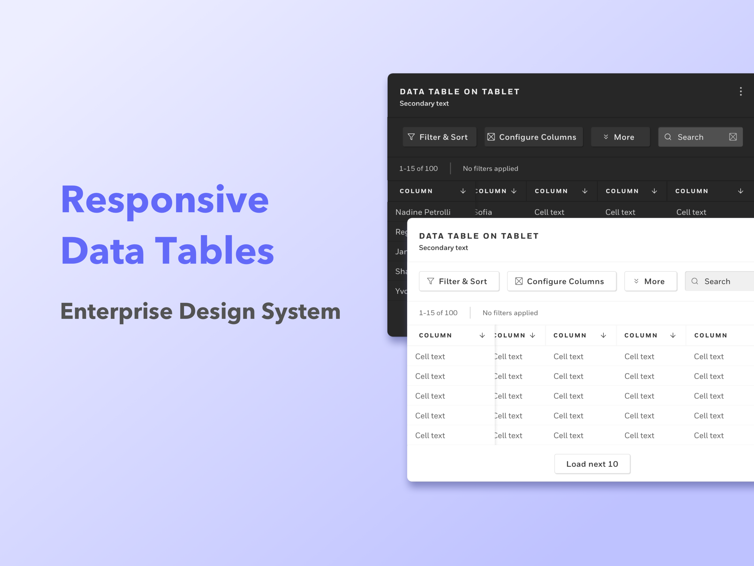
Data Tables are some of the most commonly-used but complex tools to display and manipulate information. I co-lead a research-to-build effort to create this responsive, flexible component in our design system.
👉 design system, enterprise UX, responsive design, user research, stakeholder workshop, wireframes, UI design
(Currently locked 🔒)


